Case study:
Life-saving ventilator updates GUI to help with critical COVID-19 needs.

Category: Case study
Vertical: Medical
Est. read time: 4 min
At a glance:
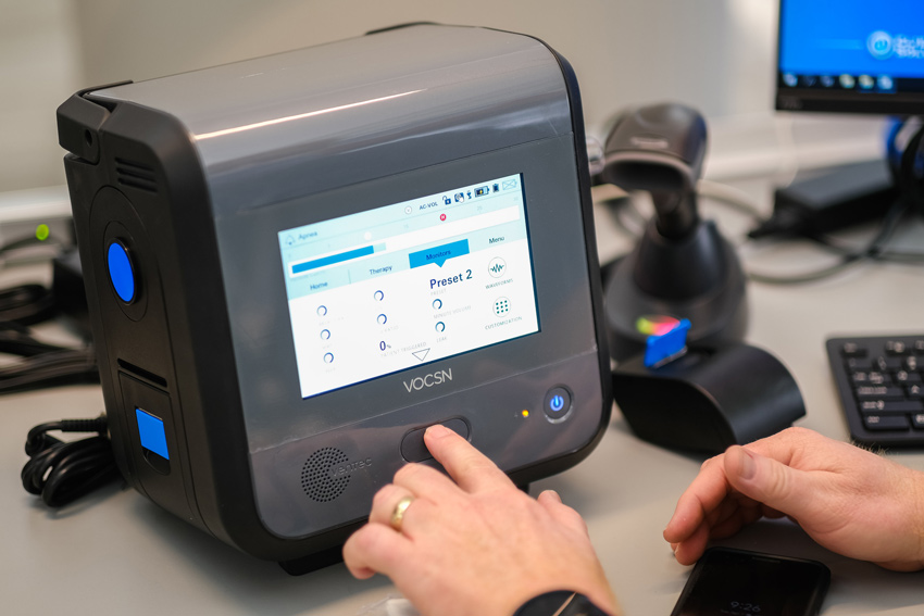
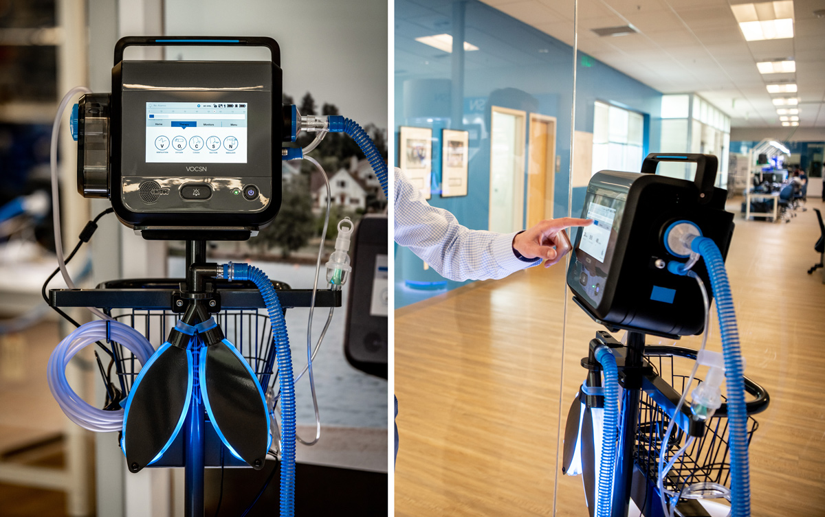
Ventec Life Systems, of Bothell, Washington, are manufacturers of the VOSCN critical care ventilator, the first and only Multi-Function Ventilator that integrates five separate devices (ventilator, oxygen concentrator, cough assist, suction and nebulizer) into one unified, portable respiratory system. The Ventec team has been a Crank Software customer since 2013, having selected Storyboard as its embedded GUI platform to create an easy-to-use touchscreen interface on the exterior of the VOSCN unit, and most recently used to add additional features in order to better meet the needs of frontline medical professionals fighting the COVID-19 pandemic.
The main challenges:
-
Designing a modern touchscreen interface that worked as well and intuitively as a smartphone
-
Getting a medical device to market quickly with a new, modern UI
-
Finding a UI development tool that could handle the design and redevelopment cycles that were going to be constant throughout the product’s lifecycle
-
Finding a solution that had a history of working proof with their operating system
-
Finding a solution that was affordable for their small team of engineers, and committed to supporting their success regardless of their size
Seven years ago, Ventec Life Systems had a vision to make life easier for ventilator patients and their caregivers by giving them a single device for all their therapies, that would improve their quality of life. Their challenge was to bring the five therapies, typically required by patients as five separate machines into a single device, so that it was portable, easy to use, and available to everyone.
To do this, they had to approach engineering and product development from a different angle. Many of the components had to be built from scratch, and electronics had to fit into the space available. The device itself was also 75% lighter than the combined five therapies alone, meaning it was much easier to transport but requiring some ingenuity for the electronics to still fit into such a smaller space.
Key to achieving this vision was making it easy to use. Patients and caregivers needed to interface with it as easily as they do today with their smartphones.
“VOCSN takes all the different operating systems across 5 different devices and puts it into one. We literally went through how people are interfacing with technology today. How do you bring what makes our cell phones so easy to use, into a ventilator[1] .” said Chris Kiple, CEO.
When Michael Holmes joined Ventec as a senior software engineer at Ventec Life Systems, he started looking into an embedded GUI solution, having had ventilator touchscreen development experience in his previous role where they used Qt. Understanding the extent of development resources that are typically required to work on a GUI from the ground up, and the modern touch interface needed for this device to succeed on its vision, he knew Ventec would benefit from a GUI development framework.

“When I joined Ventec, there were only a couple of other engineers on the VOSCN project. I couldn’t fathom getting the GUI done at the speed or quality I wanted, and with such few resources in place. Our VP of Engineering had heard positive things about Crank, and I’d seen a demonstration, and it seemed to be a good fit for what we were trying to do,” said Michael Holmes.
Being a medical device, there was also extensive effort invested into the UX, usability and safety of the user interface. The team at Ventec “really spent the time to look at all those little details, like icons, colours, and the way that people interact with them, “ said Shan Gaw, Mechanical Engineer[2]. With this amount of resources and time being invested in the user experience and design, it was necessary that the GUI software chosen would accommodate and make frequent design change easy, while not impacting the development work happening alongside.
The solution:
The engineering leadership team at Ventec knew they needed to produce a modern GUI that was as easy to operate as a smartphone, and had accepted that they would benefit from a software tool to help them get there on time, and on budget.
After evaluating other embedded GUI platforms, they decided that Crank Software’s Storyboard™ software was their preferred choice, primarily because of the sample UI demo images, free trial, and overall ease of evaluation.“We used the trial to kick the tires and developed enough confidence that Storyboard would be capable of developing a GUI with a rich feel to it, without clunky windows,” said Holmes. “Being in the medical regulated space, we also knew that we needed something that would support ongoing change without slowing our dev team down. Storyboard’s UI design flexibility and collaborative architecture made this easier for us.”
The support provided by the Crank support team also provided much reassurance that Crank was committed to Ventec’s success, and in it for the long haul.
“There was one well-known vendor that was also on our short list, however it quickly became apparent that they weren’t as interested in us, as we were in them,” said Holmes. “Our experience with Crank was quite the opposite. They were responsive from the get-go, and made us feel like they would be committed to our success. It was easy to evaluate their solutions so it wasn’t painful.”
The payoff:
The inherent design changes flexibility in Storyboard™, and the ease with which new designs can be created prototyped and tested meant that the VOSCN GUI development team could remain focused on balancing their goal of a modern interface inspired by the ease-of-use of a smartphone, while still delivering the best possible user experience.
“We went through hundreds and hundreds of different design scenarios. Spent hundreds of hours redesigning the oxygen screen, redesigning the ventilation screen. It’s a totally different way of interacting with a ventilator[3] and Crank Storyboard helped make that possible. - Chris Kiple, CEO.
Holmes was also further satisfied with the fact fewer resources were required on the GUI design, now that Storyboard was in place. “I’ve worked on larger teams in the past, but we’ve been able to be more efficient here at Ventec. The efficiency we have gained here is because Storyboard is now in place. It has helped us reduce our costs there while increasing our productivity at the same time” said Holmes.
Storyboard’s rapid iterative development architecture proved itself again in March of 2020. During the initial COVID-19 outbreak, Ventec was in communication with governors and state health officials discussing the critical, immediate need for ventilators. Rather than develop something completely new, the company wanted to take its already proven VOSCN design and focus on scale to fulfill capacity.

The Storyboard platform was used to make minor design updates and add functionality to the VOCSN touchscreen in order to better serve the needs of frontline medical professionals fighting COVID-19. At incredible speed, Ventec was able to rapidly re-design, test, and validate the new GUI, allowing faster access and support specific for COVID-19 patients.
“We continue to rely on Crank because it makes it so easy to update the user interface. We’re constantly innovating, and Storyboard lets us tweak the graphics and optimize the animations with great ease, with minimal impact on our product development cycles,” said Holmes. ”In fact, our users often comment on how much they like the touch screen interface and how quick and easy it is to set up."
[1] [2] [3]
From video on Venteclife.com about us page
https://www.venteclife.com/page/about
.png?width=180&height=67&name=Crank-AMETEK-HZ-Rev%20(4).png)

